Image Component Usage Guide
This guide shows how to use the enhanced image features in Butler documentation.
Features
- Click-to-Zoom: All images can be clicked to zoom in for better viewing
- Responsive: Images automatically scale on mobile devices
- Customizable: Control size, captions, and behavior
- Automatic: Regular markdown images get enhanced automatically
Using Regular Markdown Images
Regular markdown images automatically get zoom functionality and responsive behavior:
markdown
<ResponsiveImage
  src="/img/example.png"
  alt="Description"
/>
Using the ResponsiveImage Component
For more control, use the ResponsiveImage component:
Basic Usage
markdown
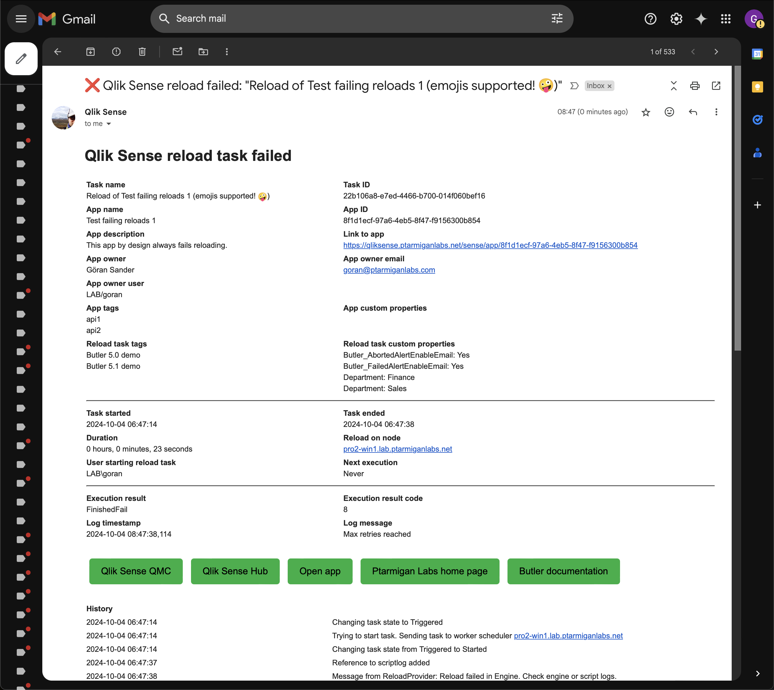
<ResponsiveImage
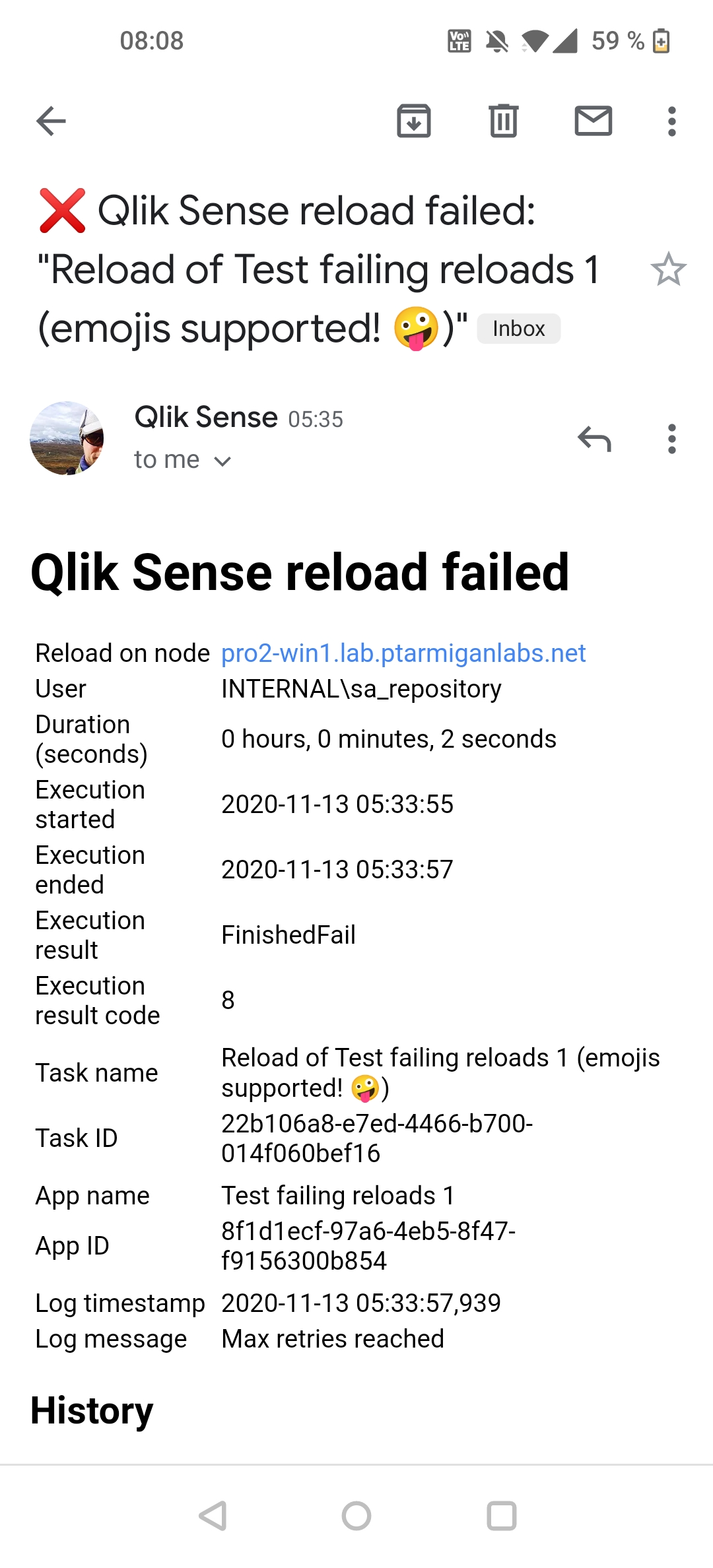
src="/img/failed_reload_email_2.png"
alt="Reload failed alert email"
/>With Custom Width
Constrain the maximum width (useful for very wide screenshots):
markdown
<ResponsiveImage
  src="/img/failed_reload_email_2.png"
  alt="Reload failed alert email"
  maxWidth="600px"
/>
With Caption
Add a caption below the image:
markdown
<ResponsiveImage
  src="/img/qlik_sense_user_email_address_1.png"
  alt="Email address in QMC"
  caption="Email address configuration in Qlik Management Console"
  maxWidth="700px"
/>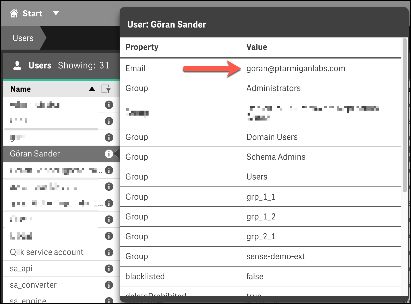
Email address configuration in Qlik Management Console
Without Zoom
Disable zoom for decorative or small images:
markdown
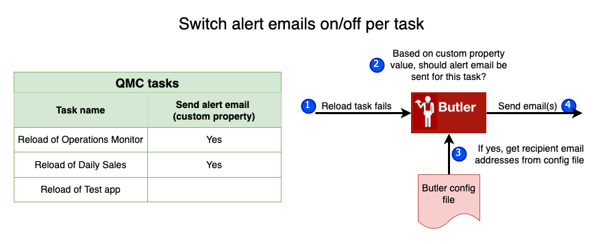
<ResponsiveImage
  src="/img/butler-alert-emails-on-off-per-task-1.png"
  alt="Alert configuration diagram"
  :zoomable="false"
  maxWidth="500px"
/>
Component Properties
| Property | Type | Default | Description |
|---|---|---|---|
src | String | required | Path to the image file |
alt | String | "" | Alternative text for accessibility |
maxWidth | String | "800px" | Maximum width of the image |
caption | String | "" | Caption text displayed below the image |
zoomable | Boolean | true | Enable/disable click-to-zoom |
centered | Boolean | true | Center the image horizontally |
Best Practices
When to Use Markdown Images
Use regular markdown syntax for:
- Simple screenshots
- When default sizing (800px max) works well
- Quick documentation updates
When to Use ResponsiveImage Component
Use the component for:
- Very wide screenshots that need size constraints
- Images that benefit from captions
- When you want to disable zoom
- More precise control over appearance
Recommended Sizes
- Full-width screenshots:
maxWidth="900px" - Dialog boxes/windows:
maxWidth="700px" - Mobile screenshots:
maxWidth="400px" - Diagrams:
maxWidth="600px" - Icons/small images:
maxWidth="200px"with:zoomable="false"
Examples from Documentation
Mobile Screenshots
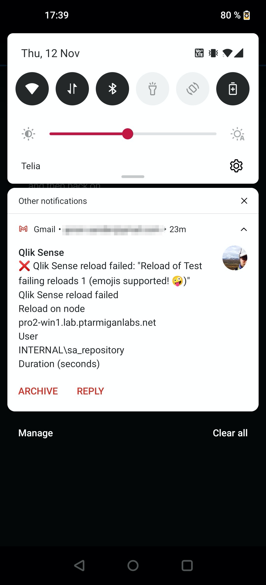
Alert notification on mobile home screen
Full email view on mobile device
Side-by-Side Comparison
For side-by-side images, you can use flex containers:
Migration Notes
When updating existing pages:
- No changes needed: Regular markdown images automatically get the new features
- Optional: Convert to
<ResponsiveImage>for more control - Recommended: Add
maxWidthto very large screenshots - Consider: Adding captions for better context
Technical Details
- Zoom library: medium-zoom
- Vue component: Custom responsive wrapper
- CSS: Automatic styling with dark mode support
- Performance: Lazy loading and optimized transitions